
Things on maps sometimes appear bigger to us than they truly are, similar to how they appear in a side-view mirror. Consider this: a globe map depicts Greenland as a massive landmass the size of South America, despite the fact that it is actually rather little in comparison.
Then there’s the Mongolian Empire, which encompasses more than nine million square miles. But how does that region seem on a map in relation to the rest of the world? Don’t worry; these maps will help you see things in a new manner and may even give you a more global perspective.
In order to make the reading experience of this article more convenient, the article has been split up into multiple pages. At the end of each page, you will see a “next” button which will take you to the next page. Enjoy your reading!
The Red has a larger total population than the Gray
As this map shows, Americans prefer coastal states since the red areas have a larger population than the gray ones. People seem to seek to the west coast for the lifestyle: the promise of year-round summer, with the vast bulk of “red” being in southern California.

Then there are those who prefer the east coast, where they may experience the lifestyles of New Englanders and the tri-state area. What we can conclude from the map is that many of the 328.2 million Americans do not want to relocate to the colder and more rural states.
When Texas is pulled out of the country and placed next to Africa, things aren’t necessarily bigger. Continue reading to see how that appears.
In comparison to the United States, New Zealand is a very small country
Given that the United States is the world’s fourth-largest country, it’s no wonder that when New Zealand is placed on top of it, the island seems to be a minor blip. To put it another way, the United States is believed to be roughly 9,833,517 square kilometers, while New Zealand is around 268,838 square kilometers.

This makes the United States 3,558 percent larger than New Zealand, a country in the southwest Pacific. Fortunately, New Zealand isn’t alone in its small size; it’s around the same size as the United Kingdom.
In comparison to South America, Greenland appears to be quite small
When you look at a globe map, Greenland appears to have the potential to overtake South America in terms of surface area. Well, we’re here to tell you that’s not the case, and this map should help you understand their relative proportions.

Let’s take a look at Greenland first. The island covers 2,166,086 square kilometers, while the continent of South America covers 17,840,000 square kilometers. That means South America is a whopping 8.2 times larger than the northern hemisphere.
When compared to Africa, Texas doesn’t appear to be all that big
While Texas is the second-largest state by area in the United States, behind Alaska, it pales in contrast to Africa, the world’s second-largest continent. Everything may be bigger in Texas, but when placed on top of Africa, the state appears to be around the size of one of the countries– which is still remarkable!

For those who like numbers, Africa covers 30,370,000 square kilometers, while Texas barely cracks one million square kilometers at 676,587 square kilometers. Africa is 45 times the size of the United States!
There Is Light Pollution Throughout the United States
If you prefer stargazing at night, we recommend traveling to the center and northwest United Areas, where light pollution is far lower than in the coastal states east of the Mississippi River. Unfortunately, according to a 2016 survey, roughly 80% of North Americans are unable to see the Milky Way.
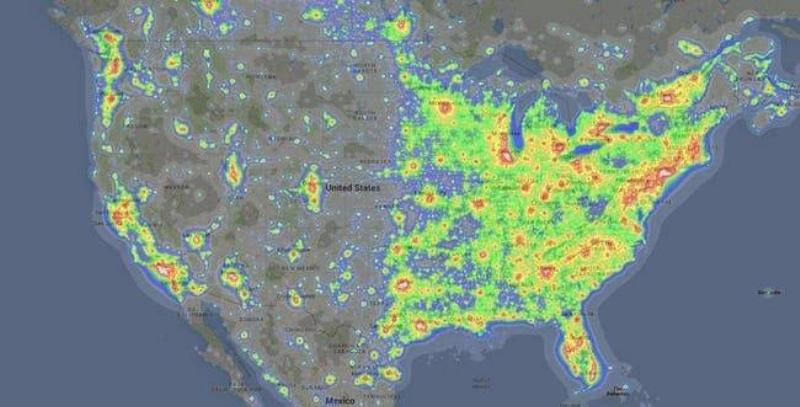
However, as geographer Tim Wallace pointed out, the bulk of states with irregular light output, such as North Dakota, are owing to shale oil extractions and large commercial structures like airports and power plants.
The country does not resemble the air traffic control zones
Interestingly, air traffic control in the United States is divided into zones and sectors rather than states. As shown on the map above, there are 21 zones in the continental United States. Each of these zones is centered on a major city like Houston, New York, or Washington, D.C.

However, air control does not end there. There are sectors and airspace with a diameter of 50 miles within these 21 zones. All of the country’s airports are located within a five-mile radius of each other in each section of airspace.
Not only can maps help us compare sizes, but they may also disclose a surprising amount about what happens in different parts of the world. Continue watching and you’ll most likely be fully pleased…
Imperial System vs. Metric System
Why the United States persists in using the imperial system of measurement is an age-old debate that the majority of the globe has with the country. Apart from Liberia and Myanmar, the remainder of the globe uses the metric system, as seen by the gray masses.
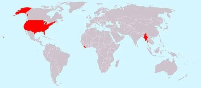
In America’s defense, the unit of measurement can be blamed on the British. When the British colonized America hundreds of years ago, they brought with them the imperial system. Since then, Americans have continued to utilize that system, opting not to join the metric system’s bandwagon.
Where Do Wild Flamingos Congregate?
While the majority of people will only ever see flamingos in zoos, they do exist in the wild in several parts of the world. These wading birds prefer Africa, Europe, small sections of Asia, the Caribbean, and the southern tip of America, as seen in the map above.

Flamingos have an interesting habit of standing on one leg, but no one understands why. Because their long, slender legs spend the majority of the day wading around in frigid water, it’s considered that they stand in this manner to preserve body heat.
The Use of Land in the United States
The United States has one of the largest and most diverse landmasses in the world at its disposal. With 3.8 million square miles to deal with, it’s only logical that the land that makes up the United States is used for a variety of purposes based on its location.

While much of the area in the west is used for woods and timber, much of the land in the middle is suitable for farm animals such as cows, sheep, and horses. National parks and the tiny northern speck of land that produces maple syrup, for example, go a long way!
Railroads that have been abandoned around the United States
From the settlements in the west to the Industrial Revolution in the east, railways played a critical part in the development of America. The first railroad was built in the year 1827. John Stevens envisioned the Baltimore & Ohio Railroad, which served both freight and passenger transportation.

As shown on the map, the majority of the abandoned railways are in the east, with the west slowly expanding. With early settlements, delayed building, the 1893 economic collapse, which halted many projects, and the ultimate invention of the automobile and airplane, which would become the more popular method of transportation, this pattern makes sense.
Flamingos prefer to congregate in very specific areas around the globe. Continue reading to find out which one it is!
Additional Evidence That California Is Its Own Country
While Italy has a larger population than California, with 60.3 million people compared to 39.5 million in the latter, the latter is plainly larger in terms of land. California easily fits over all of Italy, even crossing a few borders into Swiss territory, as shown on the map.
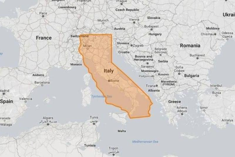
Let’s look at some data to get a sense of the size of the country vs the size of the state: Italy has a land area of 301,340 square kilometers, while California has a land area of 403,882 square kilometers, making the country 74.61 percent the size of the state.
There are eight million miles of highway in the United States
The United States Federal Highways, which was founded on November 11, 1926, now has a total length of 157,724 miles across the country. Each roadway is assigned a unique number, which is coordinated across all 50 states.
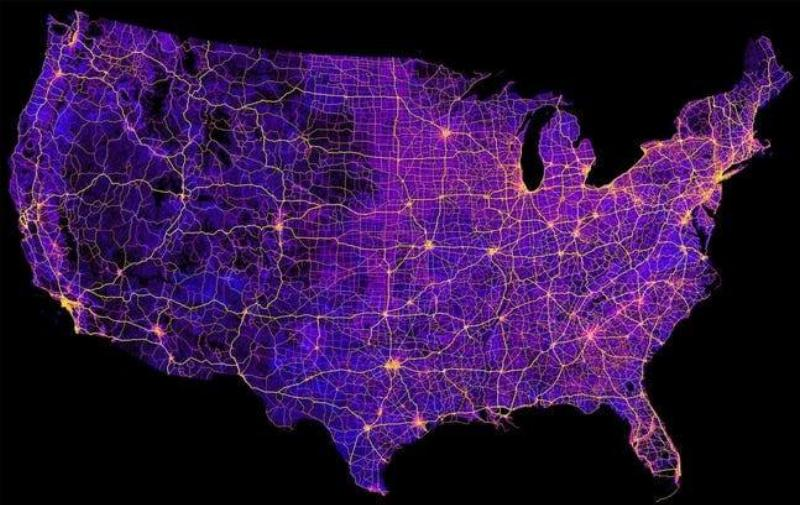
While the highways run the length of the continental United States, state and municipal governments are responsible for their upkeep. If you’ve ever driven on a New Jersey highway, you know that your tax dollars aren’t going to fix all of the potholes!
The United States’ Population Density
This map depicts the population density across the country, emphasizing how the majority of the population is concentrated in the eastern side of the country.

It appears that the West Coast is not the greatest coast.
The United States vs. Australia
It’s difficult to tell which country is larger, Australia or the United States, while looking at a globe map. As a result, we’ve layered them to get a better perspective.
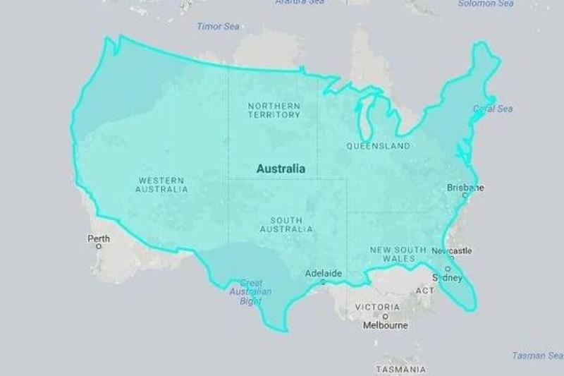
The United States covers approximately 9,833,517 square kilometers, while Australia covers 7,741,220 square kilometers. In percentage terms, America is nearly 1.3 times the size of Australia, or 27%. It’s a good thing there’s so much space in the United States, with a population of 328.2 million people!
Which of the three coffee chains, Caribou, Dunkin’ Donuts, and Starbucks, do you believe is the most popular in the United States? Continue reading to learn more!
The majority of the United States has a smaller population than Los Angeles County.
If there’s one thing to say about Los Angeles County, it’s that it’s crammed as tightly as a tin of sardines. As demonstrated above, the single county of Los Angeles, with a population of 10 million people, out-populates the vast bulk of the United States, according to the 2019 census.

It’s true that North Carolina and Georgia should be included on this map with Ohio, Illinois, New York, Florida, Texas, and Pennsylvania. With a population of 10.49 million people in 2019, North Carolina slightly edges out Los Angeles County, while Georgia has a population of 10.62 million.
Cuba is a good fit for Hudson Bay.
Given how small bays appear on a globe map, it’s incredible to see an entire country fit snugly inside a body of water. Thankfully, we have this “perspective map” to show us how big Hudson Bay is in comparison to Cuba, the island nation.

To begin, let me state that the bay is enormous in comparison. The Hudson Bay covers 1,230,000 square kilometers, while Cuba covers 110,860 square kilometers. With such a large size inconsistency, it’s no surprise that Cuba appears to be nothing more than a sandbar on this map.
The Mediterranean Sea in Comparison to the United States
The Mediterranean Sea is placed over a map of the United States in this map. It’s amazing to observe the similarities between the two! The Mediterranean Sea covers 970,000 square miles, or 0.7% of the world’s oceans.

The United States covers 3.797 million square miles, which is larger than the Mediterranean Sea.
The United States If States Were Divided According to Density Of population
Wouldn’t it be fascinating to open a textbook and see a split-up map of the United States like this? While most pictures of the United States show all of the borders connected, this unique view shows how the map might look if it was created based on population density of each state.

As you can see, the states of California and Florida haven’t changed much, if at all, but Alaska, the country’s largest state, has shrunk to nearly nothing! Also, can we talk about how large New Jersey is in comparison to its normal size?
The United States vs. China
It’s no secret that China, with a population of over one billion people, is the world’s most populous country. However, when it comes to land surface area, it is simply beaten out by the United States.
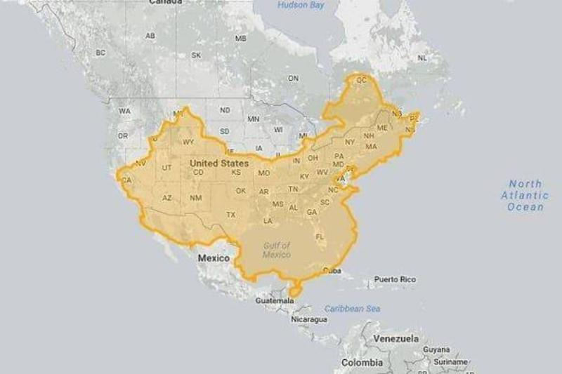
With a little creativity, you can see that if you reconfigure China’s shape, it is nearly the same size as the United States. However, China is somewhat smaller than the United States, with a total area of 9,596,961 square kilometers vs 9,833,517 square kilometers.
Middle America’s Population = Both Coasts
It’s no secret that the majority of people choose to reside on the east or west coasts rather than in the middle of the country. However, the population of both coasts may surprise you when compared to the vast bulk of the country’s middle states.

To put it another way, the orange section of the map corresponds to the population of the red portion in the middle. We propose residing somewhere in the red section of the map if you’re not a sociable person.
Mongolian Empire’s Extensiveness In the year 1279
Mongolian Empire was the world’s largest bordering land empire in history. The Empire spanned from Central and Eastern Europe to the Sea of Japan, northward into part of the Arctic, westward into the Carpathian and Levant Mountains, and into the mainland of Southeast Asia, the Indian subcontinent, and the Iranian Plateau during the 13th and 14th centuries.
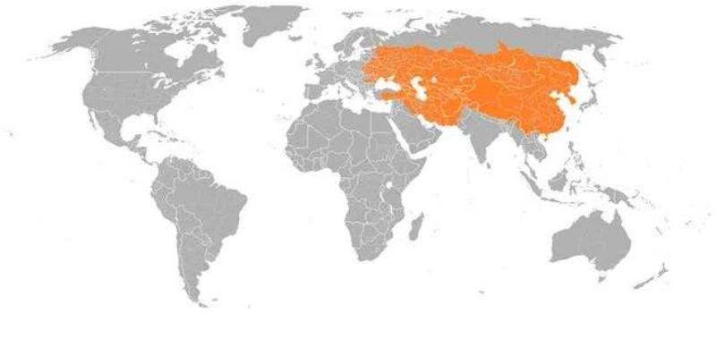
Genghis Khan rose to power as the result of an alliance between many nomadic tribes and mercilessly conquered a large portion of the world. After years of rule, the Empire was finally brought down by a war over succession. Prior to that, the Empire covered an incredible nine million square miles.
Farmland outnumbers trees in Middle America
The United States of America is home to 8% of the world’s woods, with over 228 billion trees. And, as the image shows, such forests are more thickly populated in the northwest and east of the Mississippi River, respectively.
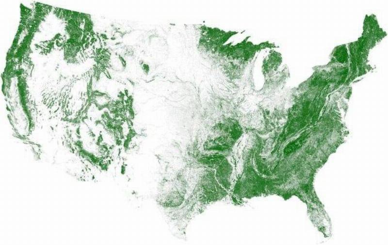
Contrary to common assumption, the average amount of wood per acre has increased dramatically since the 1950s, which is remarkable given how much growth was uprooted when European settlers first came to America. People are more aware of the value of nature than ever before. Michael Bloomberg, the then-mayor of New York, set a goal of planting one million trees in the city by 2017 – and he achieved it!
A Number of Well-Known Coffee Shops in the U.S.
If there’s one thing that most people all over the world agree on, it’s that you should never get in the way of their coffee habit. In the United States, you can get your coffee fix from one of three popular chains, or two if you count Caribou, which is only available in Minnesota.
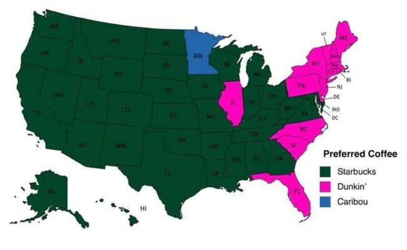
Given the scarcity of Dunkin’ Donuts locations once you pass the Mississippi River, it’s no wonder that Starbucks is the favored coffee shop of the vast majority of states, with the exception of a few southern states, the north, and, oddly enough, Illinois.
Although Google Street View has spread around the globe, certain countries still lack the necessary equipment. The next map will help to put everything into perspective.
Google Street View Coverage Around The World
In 2007, Google Street View debuted in a number of locations across the United States. Since then, the technology has spread to locations all over the world, encompassing both rural and urban areas. The unique aspect of Google Street View is that the cameras are mounted on a variety of types of transportation.

A Google tool is responsible for the majority of the pictures. However, depending on the geography, some personnel choose to photograph on foot, on a snowmobile, or on a tricycle. There are even boats that are connected to the technology! Google Street View is still unavailable in regions like Russia, China, and the majority of Africa.
India vs. the United States
India is the world’s second most populous country, with over one billion inhabitants, however it is just the sixth largest in terms of surface area. While the United States may not appear to be significantly larger than a South Asian country, it is — nearly three times larger, to be precise.

India has a surface area of roughly 3,287,263 square kilometers, whereas the United States has a surface area of 9,833,517 square kilometers. So, if you see a word map soon, don’t make the same error we did and believe India can fit within America’s borders. The country is larger than it looks on a globe map, despite its diminutive size!
Only a few countries have populations under 100 million people.
Given the world’s population of 7.594 billion people as of 2018, it’s remarkable that certain countries have populations of less than a hundred million people. It’s easy to see why Australia, New Zealand, Canada, South America, Africa, Asia, and even portions of Europe have fewer populations when looking at this map.

First and foremost, areas of Australia and New Zealand are uninhabitable. Then there are various countries in Africa and Asia that are relatively rural, although people choose to live in cities. Then there’s the bitterly cold and miserable weather that has gripped Europe and Canada.
Russia vs. China
On a globe map, it is evident that Russia is significantly larger than China. But, perhaps, this image illustrates just how much bigger it is. China appears to be a bit of dust on the world map when compared to the northern country, although the two countries overlap rather closely.

China isn’t the tiny country that a global map would have us believe, having a surface area of 17,098,242 square kilometers. With a surface size of 9,596,960 sq km, China is 44% smaller than Russia. Yes, it is still little in comparison.
While Antarctica is large, it appears to be much larger on a globe map.
Antarctica has taken over parts of the United States and Canada
Antarctica nearly covers the whole surface area of the North American continent, which is 24,490,000 sq km. Unfortunately, it falls short, which is surprising given how huge the frozen tundra appears at the bottom of a global map. At the very least, it puts its size into perspective.
Antarctica has a population of 4,490 people and a surface area of 14,200,000 square kilometers. The continent is 75 percent greater than the United States’ 9,833,517 square kilometers and 40 percent larger than Canada’s 9,984,670 square kilometers.
The United States’ Noisy and Peaceful Regions
Apart from being a lovely picture of noise pollution in various locations of the US, it also illustrates where the majority of people congregate. If you’re familiar with the states, you’ll notice that most noise spikes, which are yellow in color, occur near major cities like Los Angeles, New York, Miami, and Dallas.

Then there’s the dark blue, which depicts the country’s quieter parts. The majority of the Pacific Northwest, as well as Maine, can be seen here. These communities are more rural, with fewer residents than, say, Manhattan, New York.
Surges in population do not occur near the Canadian border
The United States has a population of 328.2 million people as of 2019. California has 39,747,267 residents, Texas has 29,087,07 residents, New York has 19,491,339 residents, and Florida has 21,646,155 residents. Those figures are just provided to put this population spike map into context.

As you can see, the surges are biggest in states where the population is already among the highest in the country, with little to no spike close to the Canadian border.
Montana is a perfect fit for Mongolia
Montana is a western United States state recognized for its wide-open areas, majestic mountains, and quiet atmosphere. As a result, when it comes to its size, people frequently mistakenly believe it is larger than it is. On a world map, however, it is a small dot in the middle of a massive continent.

Then there’s Mongolia, a country that appears to be much larger on a map than it is. Just have a peek at this illustration for some context! Mongolia is clearly larger than Montana, yet with a surface area of 1,564,116 square kilometers, it is just 4.1 times the size of Montana’s 376,962 square kilometers.
Do you want to get a sense of how many Springfields there are in the US? Continue reading to learn more.
The Most Effective Route For Visiting All Of The Springfield Towns In The United States
If you’ve ever been throughout the United States, you’re aware that some communities have the same name in different places. One of the names is Springfield. According to a geological survey, there are 33 populous settlements with the name in the continental United States, spread across 25 states, including five in Wisconsin alone. That doesn’t include the townships.

When it comes to townships, there are 36 in the United States, with 11 in Ohio. The above map is the greatest way to take if you’re planning a road trip soon and want to visit the Springfield of America.
Poland may be fitted into Texas
If you put Poland within Texas, you’d have plenty of area to drive about without ever having to enter Poland. Everything in Texas is bigger, and they can now add bigger than Poland to that list.

The United States’ sheer vastness is astounding, especially when you realize that one state is greater than many countries across the world.
Many countries can fit inside the United States at the same time
Despite the fact that the United States is not the world’s largest country by landmass, there are still a considerable number of countries in the world that could all fit inside it at the same time.

This map, created by a Reddit user, makes excellent use of practically the entire area of the United States while leaving very little room for error. Despite its vast land area, much of the United States remains unpopulated.
At a Glance: Canada, the United States, and Mexico
Many maps are not drawn to scale, as anyone who has studied geography will tell you. When you look at a globe, the US appears to be a gigantic monster towering over its neighbors. The United States isn’t nearly as big as we’ve been led to believe.
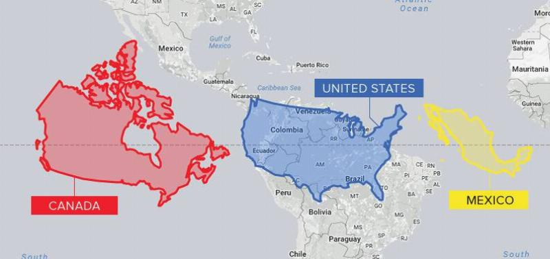
Canada is, in fact, the world’s second-largest country, with a landmass that dwarfs that of its southern neighbor. The United States has a landmass of 9,833,517 square kilometers, while Canada has a landmass of 9,984,670 square kilometers. Mexico is likewise significantly larger than our existing maps suggest.
Every city with a population of 100,000 or more around the world
When you map out all of the cities in the world with populations more than 100,000, you’ll be surprised at how few cities make it. This map, predictably, displays a lot more coverage for a city of that size in countries like Asia, where population has risen in recent years.

Of fact, this excludes many suburban areas where cities appear every few miles, many of which have fewer than 100,000 residents within their city borders but over a million people living in close proximity.
A Majority Of The World’s Population Is Represented Within This Circle
It’s incredible to consider that more than half of the world’s population lives within this highlighted area on the global map. Although it covers a huge region, much of the population lives in big urban areas that have sprung up in recent years.

For instance, the United States has only about 5% of the world’s population despite its comparatively huge land area.
There’s Only One Sport That Can Almost Take Over The World
We don’t think it’s surprising. Soccer (futbol) is the most popular sport in many countries around the world, which comes as no surprise. Cricket may surprise many Americans, yet it is an international sport involving well-known athletes and hundreds of millions of followers.

Football is the most popular sport in many states, but basketball and baseball all have a sizable following.
Images From NASA Show Where Fires Are Spreading Around the World
NASA’s Earth Observatory Team took a satellite photo of all current fires around the planet in July 2020. Scientists have warned that if climate change isn’t addressed, active flames would continue to expand.

NASA’s satellites are more likely to emphasize places with greater temperatures and dryer conditions, as we might predict. Every month, NASA collects this information and publishes the findings for historical review.
Driving from the left vs. the right
Why is it that every film we see outside of the US has left-hand driving? In actuality, most people drive on the right side of the road in most parts of the world.

This looks to be one of the few areas where Americans got it right, owing to the fact that the US was well ahead of the pack in terms of mass-market automotive development.
A single map depicting population density around the world
Despite the fact that our planet has a large landmass, the majority of the world’s population lives in less than half of the space available.

This isn’t exactly a surprise. People have long gathered in areas with important commerce and plentiful water and natural resources. Many places on the planet are simply not designed to support large populations, if any at all.
What a Real World Map Should Look Like
The Hobo-Dyer Equal Area Projection map depicts how the world appears when the correct landmass sizes and dimensions are used.

This is a totally different perspective on our world, and it puts everything in context. We must admit that until seeing the Hobo-Dyer map, we were unaware that half of the countries on our earth were larger or smaller than we had been told our entire lives.
All of these countries can fit into Australia
Australia does not appear to be very large on most globe maps. In reality, it is a huge country and continent with a total area of 7.7 million square kilometers. The continent’s vastness can accommodate a lot more countries.

Denmark, Sri Lanka, Greece, Cambodia, Taiwan, South Africa, Albania, South Korea, Thailand, East Timor, Romania, New Zealand, Japan, West Malaysia, Ecuador, the United Kingdom, Germany, Portugal, Italy, and France are among the countries that could fit inside.
Projection of Mercator
The Mercator’s Projection is used to depict modern global maps. Other projections exist, but this is one of the most popular.

Mercator’s Projection has just one flaw: it is extremely incorrect. A true world map would plainly demonstrate that South America lies almost entirely to the east of the United States, as well as much of North America in general.
Japan Isn’t As Small As It May Appear
Japan appears to be a little island country on modern maps employing the Mercator’s Projection, and it appears to fit inside most other countries. With 145,914 square miles of territory, the country is actually rather big. By placing Japan adjacent to the east coast of America, this map puts its enormity into perspective.

Japan could house a huge portion of the United States’ population. This isn’t surprising given the country’s population of 126.5 million people, or nearly one-third of America’s total.
About half of all Canadians live south of this red line.
Only two provinces, Ontario and Quebec, include more than half of all Canadians. What’s more incredible is that more than half of the population lives south of the map’s red line.
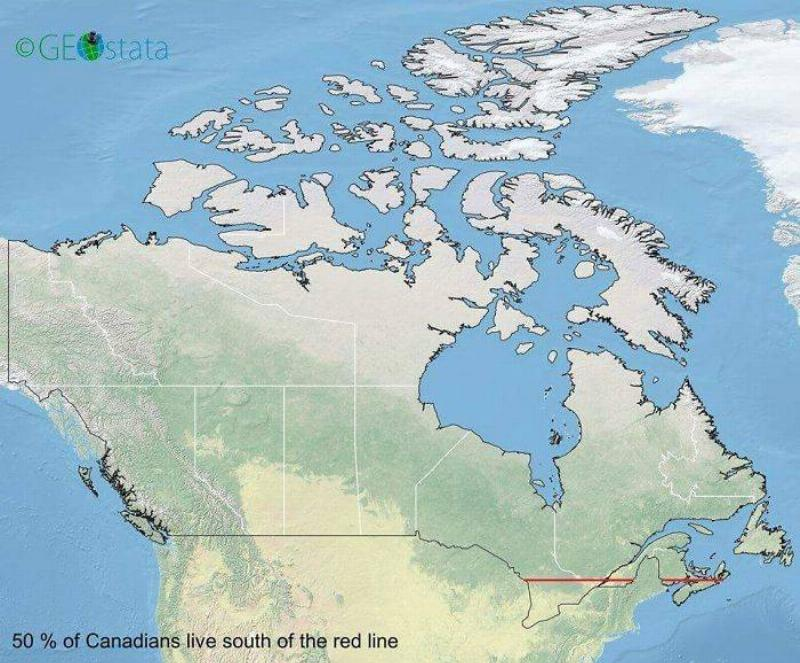
The population of Canada is 37.59 million people, which indicates that approximately 20 million people reside in a very tiny area of the country. Of all, this simply means that more of the country’s natural beauty can be preserved.
The Animal Migration Routes Across North America Are As Followed
North American animals will go to tremendous efforts to move from cold to warm conditions. The caribou is particularly remarkable, as it may travel up to 3,025 kilometers in a single year.

This map depicts North America’s major mammalian mass migration routes. Large mammals aren’t the only ones affected. Monarch butterflies can fly up to 3,000 miles to their wintering grounds. While the map does not identify which species travel these pathways, it does provide a wonderful image of how far creatures will go to survive.
Shared Borders Are Visible On The Topologist’s World Map
Allow us to explain why this globe map appears to be so distinct. The traditional picture of our world is replaced by touchpoints for shared borders between countries on the topologist’s map of the world.

North and South America, for example, are depicted at the bottom of the globe, with touching borders that run the length of their shared landmass. This picture shows all of the connected major landmasses, which are surrounded by unconnected island masses. When compared to standard maps, it’s merely another way to see how interconnected our globe is.
A Map Of The United States’ Rivers
If you drive around the United States and count how many rivers you see, you’ll be shocked at how many rivers there are.

In the United States, there are over 250,000 rivers covering almost 3.5 million miles. With a length of 2,540 miles, the Missouri River is the longest of the three rivers.
The Mississippi River is fed by 7,000 rivers
Although the Missouri River is the longest in the United States, the Mississippi River has the greatest depth and volume. The river is nourished by 7,000 different rivers that crisscross the United States.

This map depicts all of the rivers that flow into the Mississippi River, as well as the river’s final destination. That explains why the Mississippi is such a massive river.
With 1 billion people, the world is divided into 7 regions
This color-coded world map depicts how much land each region would require to reach a population of at least 1 billion people. Despite the fact that various continents, like North America, South America, and Australia, absorb a large portion of our planet’s landmass, China’s population would still outnumber all three.

As previously stated, over half of Canada’s population is concentrated on a small sliver of land when compared to the country’s overall size.
Overlay Of The Contiguous United States On Top Of The Moon
A landmass of 2,959,064.44 square miles covers the contiguous United States. There would still be enough space for other countries if we laid the entire area over the moon.

The overall surface area of the moon is about 14.6 million square miles. Asia, with 17.21 million square miles of surface area, would be your best pick if you wanted to take up all of the available space on the moon.


GIPHY App Key not set. Please check settings